I'm Carlie and I currently work as a data journalist for USA TODAY's interactive graphics team, but I've previously worked at Honolulu Civil Beat, The Dallas Morning News, Investigative Reporters & Editors, The Columbia Missourian and The Shreveport Times.
Whether it’s making maps, analyzing data, designing graphics or developing tools - I want to combine journalism and technology to tell stories in innovative, captivating and impactful ways.
My biggest goal is not just to inform, but to encourage the public to want to stay informed. I also enjoy improving newsroom technologies to make it as easy as possible for journalists to do their jobs.
Below are some of my favorite projects I've developed and designed.
USA TODAY
I started on GateHouse Media's Data & Investigations Team in December 2019, and when the Gannett/GateHouse merger happened, I moved over to USA TODAY in early 2020 and started working on the graphics team. The merger is why I have two online staff profiles (1 and 2)! Check out some of my team's top work from 2020, 2021, 2022 and 2023!
I work on a branch of the graphics team dedicated to interactive graphics, and most of my work involves sourcing, analyzing and visualizing data for national stories and investigations. One of my favorite parts about being on this team is being able to help our local properties within the USA TODAY Network with their stories too!

Dying for Care: How one nursing home stood out
I worked with the investigations team to analyze deaths in nursing homes during COVID-19 and created two scrollytelling animations in the story. This project caused helped spark change on the federal level, and was nominated for awards by the NIHCM Foundation and Scripps Howard Fund.

I wrote and visualized an explainer for how the US power grid works and is managed after the February 2021 Texas blackout, and worked with an animator on my team to make the story into a scrollytelling format. It won an SND Design Award of Excellence in business infographics!
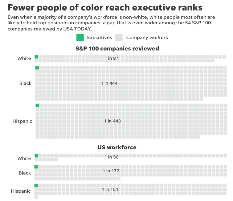
How top US companies are struggling to diversify leadership
I made data visualizations for an investigation we did on diversity within the S&P 100's companies by requesting and analyzing their EEO forms, along with making a searchable database for each company's data.

How Biden won the electoral college
Tetris is my favorite sport, so we came up with a way to visualize Biden's electoral college win by turning the states into Tetris pieces.

How Saugus police skew citation data by mislabeling drivers
I worked with local Massachusetts reporters and the USAT data team on an investigation of police citation data that found police mislabel drivers with Hispanic last names. I created a graphics-centric narrative of the investigation's findings to go along with the larger story, as well as a full page print version of the story.
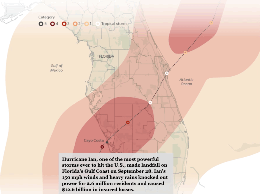
Ian's deadly path: A visual look at how the hurricane devastated Florida
I worked with an editor in Sarasota to launch a data-gathering initiative to compile regional information on Hurricane Ian's damage across Florida.

Four maps that show how America voted in 2020
We created four interactive maps that showed different ways of analyzing the election data from 2020, by analyzing each county's shift from the last election, the voter turnout, the population size the split among parties.

The Prison Sell: Arizona raked in millions from selling prison labor
I worked with reporters from The Arizona Republic on a series that examined how the state prison system sold prison labor to private companies. I helped organize the findings, create the narrative and made several graphics across all the stories. It was nominated for a Silver Gavel Award by the American Bar Association.
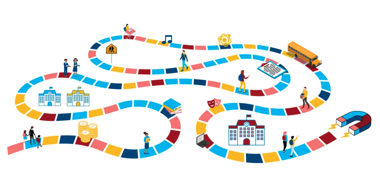
Magnetic Pull: An investigation into magnet schools
I made an infographics-centric presentation for the Louisville Courier Journal's investigation into a magnet school and how it favors richer, less diverse kids from certain middle schools in the area. It gained over 150 subscribers in its first few days after publication and won a companywide "Best of Gannett" award.
Honolulu Civil Beat
I joined Honolulu Civil Beat in December 2018 for a yearlong data fellowship to enhance investigative news stories with more data, maps and graphics. I contributed to about 100 stories in my year there, including a few I took the lead on.
Our newsroom won a 2019 national general excellence award from the Online Journalism Awards for our innovative projects and digital presentation, and my graphics and maps played an integral role in two of the three projects cited for the award. I also won multiple awards for my data journalism stories from the Hawaii chapter of the Society of Professional Journalists.

Economic Effects of Sea Level Rise
To make this gif, I used QGIS to edit the geographic data, then Illustrator and Photoshop to add details and animate it. I also made similar gifs for other stories in the Hawaii 2040 series like this one.

I made this interactive Tableau dashboard to display survey responses from students in public high school on how safe they felt in their schools.
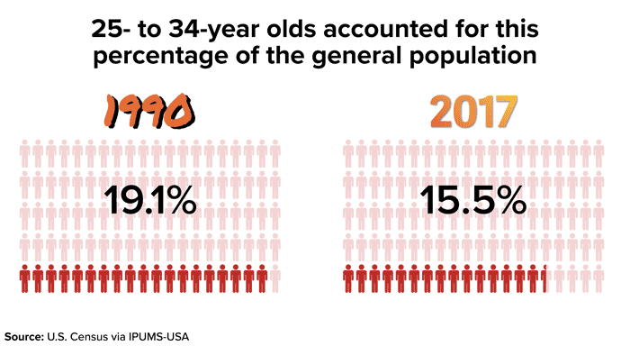
10 Charts That Show The Struggle Of Being A Millennial In Hawaii
I helped come up with this story and gathered all the data for it using Census microdata (via IPUMS), then I created all the graphics in Illustrator while a reporter helped write the text.

How Seawater Air Conditioning Works
I made this graphic to explain how seawater air conditioning works in Illustrator, and animated it in AfterEffects. I also made a print version that was featured in a cover story for The Christian Science Monitor.
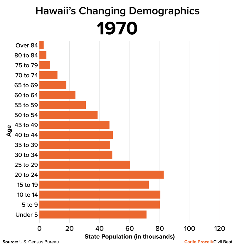
Hawaii's Changing Demographics
I created a population pyramid (without gender) using Census data to spotlight how Hawaii's population has changed over years in amount and age.

Hawaii's Chronic Teacher Shortage
I worked with a remote freelancer to develop some Tableau dashboards that show data about teacher shortages in Hawaii. I gathered the data and then edited his work so it would be responsive on our website.

9 Charts That Show How Hawaii Tourism Is Changing
This charticle shows data behind how tourism has changed over time in Hawaii. I helped interview and report this story along with gathering all the data for it and visualizing it in Datawrapper, ArcGIS Online and Illustrator.
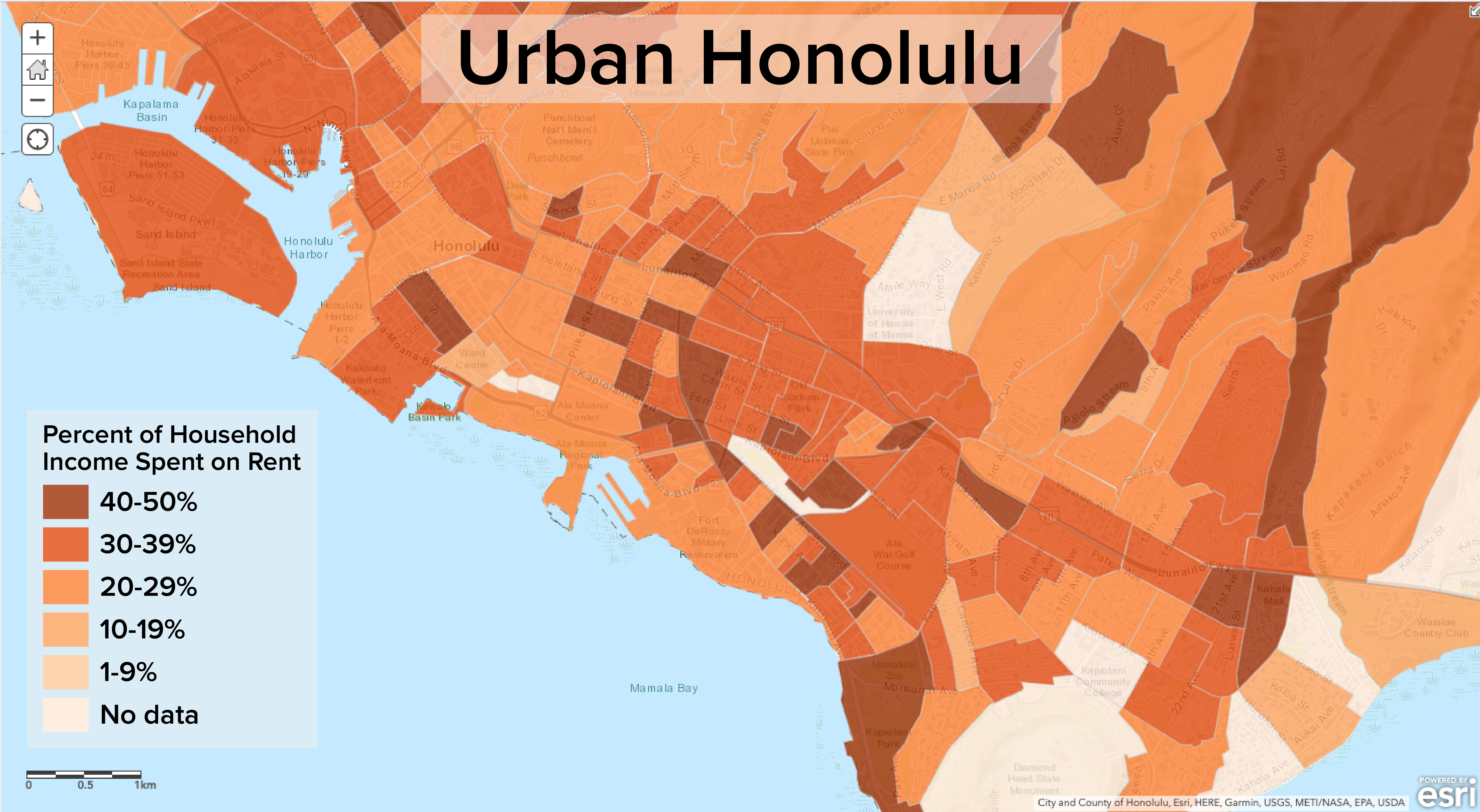
Where Hawaii Renters Spend Half Their Incomes On Housing
I used Census data to create an interactive map in ArcGIS Online that shows the percent of income renters spend on housing, then I pulled out different areas of the island to spotlight and worked with a reporter to write about our findings.
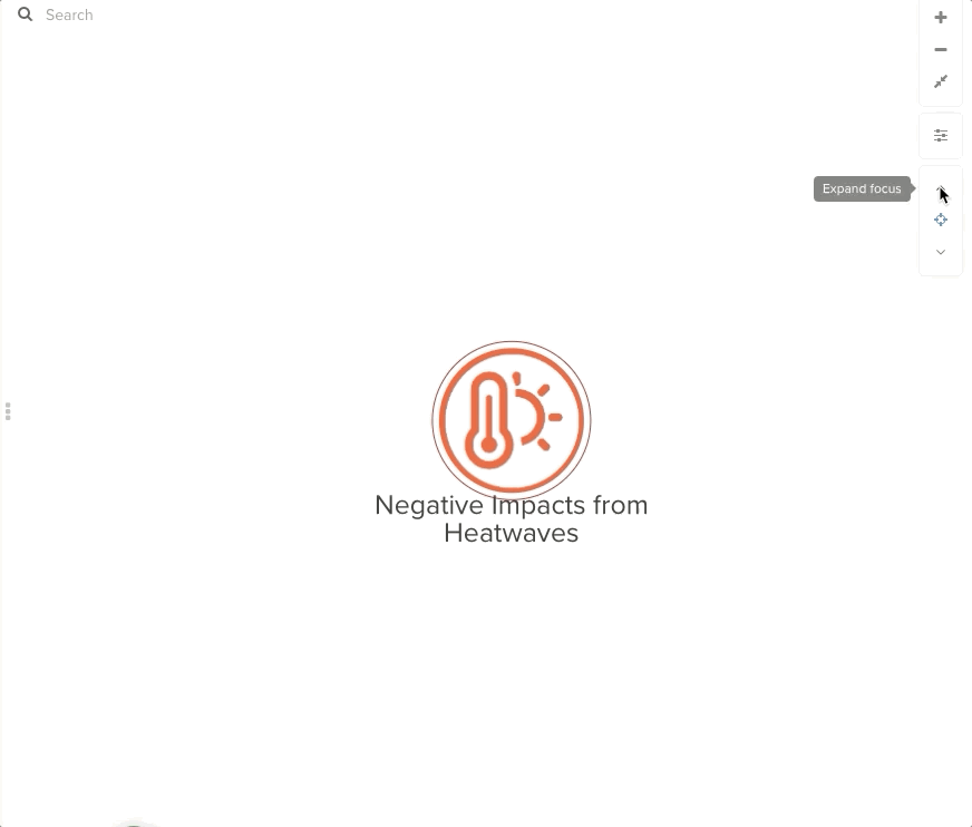
I scraped and cleaned article excerpts that scientists compiled to make a network graphic (using Kumu) that showed the negative impacts of heatwaves.
The Columbia Missourian
I spent two semesters at The Columbia Missourian as graphics editor where I directed and assisted a team of students from the journalism school's Information Graphics class in producing award-winning infographics for print and web publication. Between the two classes (one from each semester), we produced about 300 graphics.
Click here to see all the graphics I edited, and below are a few of my favorites:


And here are some bigger/longer projects that I worked as a graphics editor on:

This semester-long series followed a bill through the legislature to explain how bills are passed in the state, and we created several graphics for it such as the logo above and this full page graphic.

This semester-long series that looked at broadband access across rural Missouri, and we did several graphics for this as well such as the series logo, multiple maps and graphic explainers.

For the Homecoming magazine insert, I created a new style guide to match the magazine and worked with my designers to conceptualize about a dozen festive print graphics about topics like football stats, the parade route, tailgate games and locator maps.
Also at the Missourian, I worked one semester as a staff graphic designer and two semesters as an education reporter where I focused on data stories. I also worked general assignment shifts where I reported a variety of daily news stories. Here are a few of the graphics I made there:
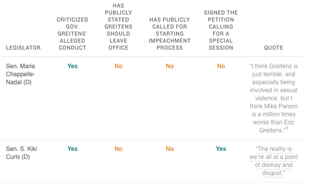
I worked with the state government editor to direct a team of reporters who compiled a comprehensive list of lawmakers' stances on an issue, then I created the online presentation for it on our site using an NPR daily graphics template and a Highcharts bar chart to summarize the stances.
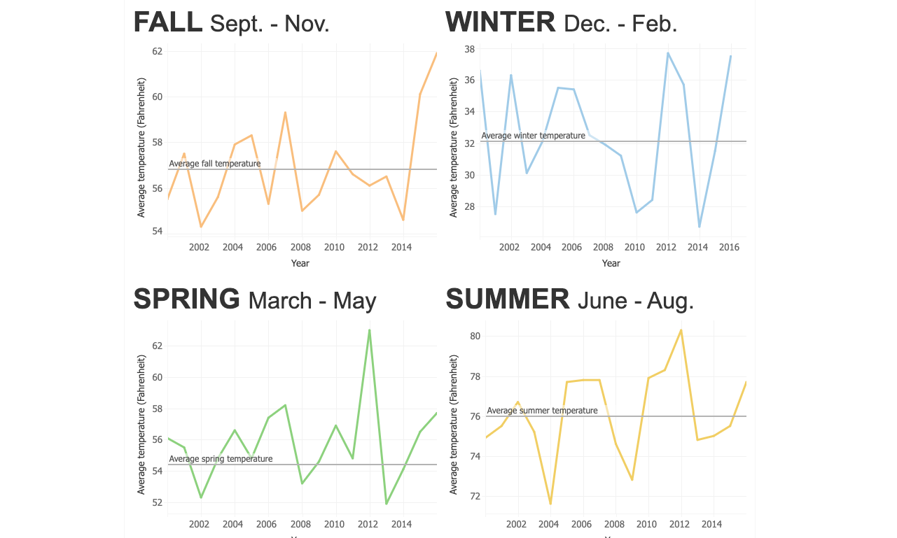
I made an interactive line chart dashboard in Tableau to show average seasonal temperature changes since 2010 in Columbia, Missouri.
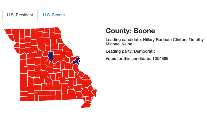
For this map, I worked on a team to build a map of Missouri that displayed results from the U.S. presidential and senate races as they came in. I built the map with TopoJSON files and used D3 and Underscore.js to connect the data to it. (source code)
The Dallas Morning News
I spent the summer of 2017 as the data & interactives intern at The Dallas Morning News. While there, I helped develop a Django app from back-end to front-end that tracked restaurant health inspections across Dallas and Tarrant counties. I also made several interactive embeddables, which you can view all here. Below are some of them:

I made this interactive to show basic facts about Greek chapters, along with a picture and quote from each one. I used Handlebars along with the script to connect a Google sheet to an S3 bucket so that the reporter could update information as she acquired it. (source code).

I made this template so that it would be easy for others on the Interactives team to make embeddable sliders for stories to introduce people/places/etc. in a story. This uses the same mechanics as the divine nine interactive to retrieve data from a Google sheet. (source code).

I made this interactive for a story on summer reading books that high schools were assigning. I used a jQuery plugin to make a series of image sliders where the top image was a synopsis of the book and the image underneath revealed the book cover, title and author (which I made in Illustrator). (source code)
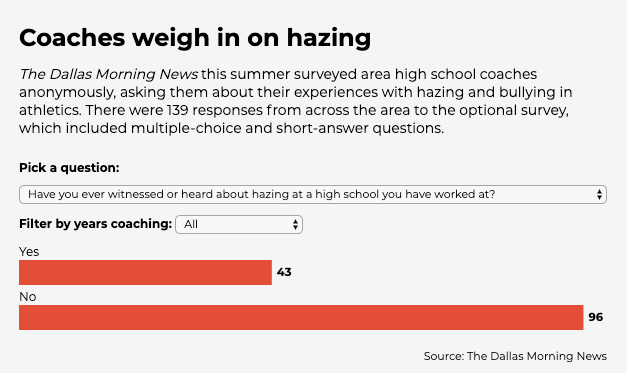
I made this interactive to showcase results from a hazing survey. I wrote some Python to parse the survey results, then built a dynamic bar chart in D3 that's controlled by two drop down menus (and then I filter through the data using lodash.) (source code)
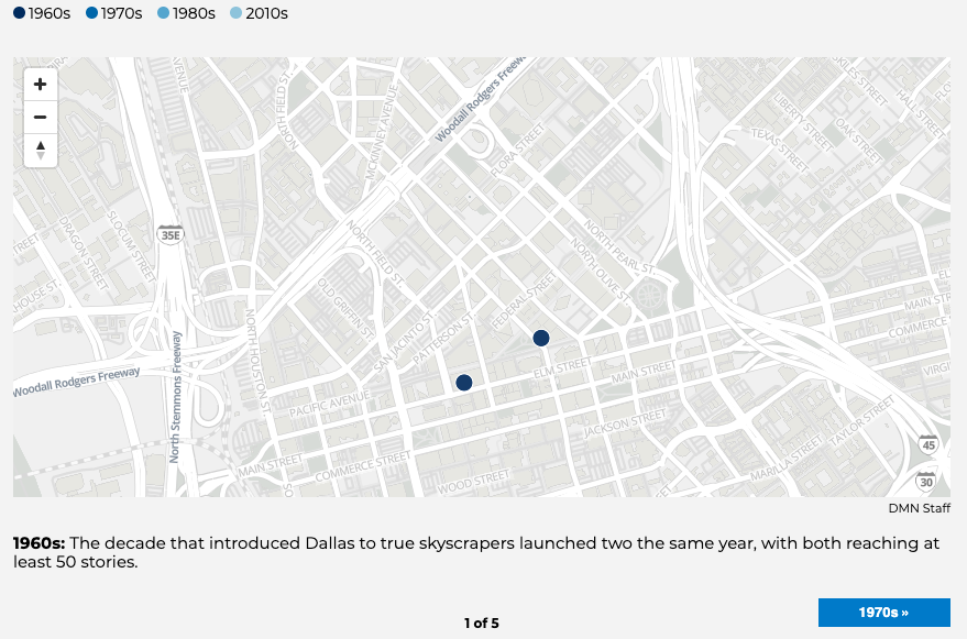
I made several maps using Mapbox and a script that connects Google Sheets to an S3 bucket so that they can be updated by the author whenever needed. This one is a step through map of skyscrapers in Dallas over the decades with a tooltip. (source code).
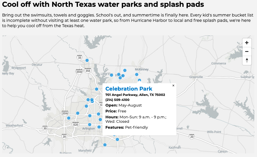
This is another map I made there that shows the locations of waterparks across the DFW area and details about them. (source code).
The Maneater
While I was the online development editor at Mizzou's student newspaper, The Maneater, I spent most of my time doing backend development work to make the site run more smoothly and with more capabilities. But I also designed and developed many special sections. I highlighted some below:

I worked alongside a reporter to make a Vox cards-esque interactive slider with Javascript to explain what Title IX is. This won an honorable mention for multimedia package from the Missouri College Media Association in April 2016. (source code)

I designed several long form pieces at The Maneater. One was this award-winning piece on leadership culture at Mizzou. (source code)

I designed an award-winning interactive timeline of events leading up to the fall 2015 protests at Mizzou. The timeline received over 200,000 views within the month and was linked to by multiple national outlets including The New York Times. This piece is also prominently featured on the Timeline JS website as an example. (source code)
Other work

Along with designing the cover for IRE's 2018 Mapping For Stories book, I also copy edited the text, tested the lessons in QGIS and researched mapping examples to add to the back.
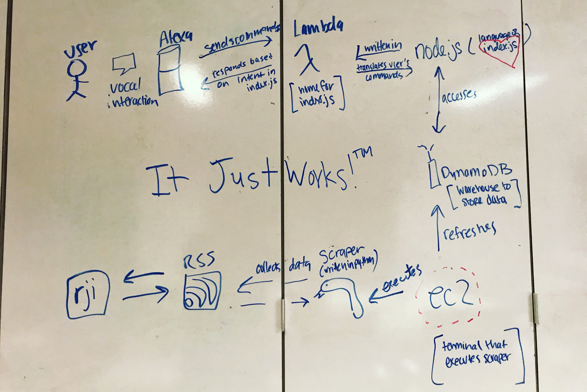
I worked as the developer alongside two journalism students for an Alexa Skill for the Reynolds Journalism Institute. Our skill scrapes articles from their RSS feed based on tags said by the user. I wrote the skill itself in Node.js and implemented it with a Lambda function, and I wrote the scraper in Python. The scraper stores the data in a DynamoDB table which updates via an additional Lambda function. I created a how-to guide on how to do the skill here and our demo for the skill is here.